Brand Identity for ROJO
Brand Identity for ROJO
Brand Identity for ROJO
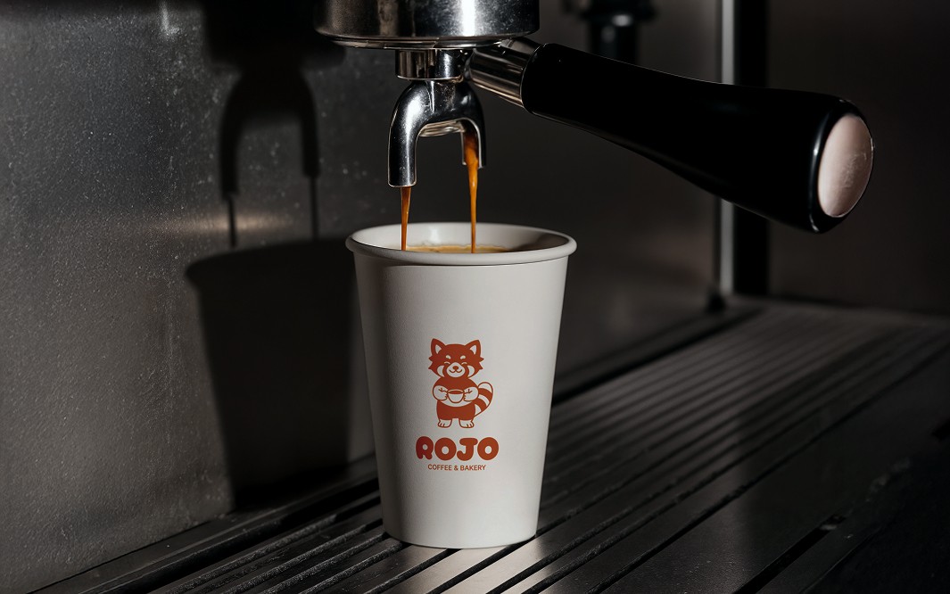
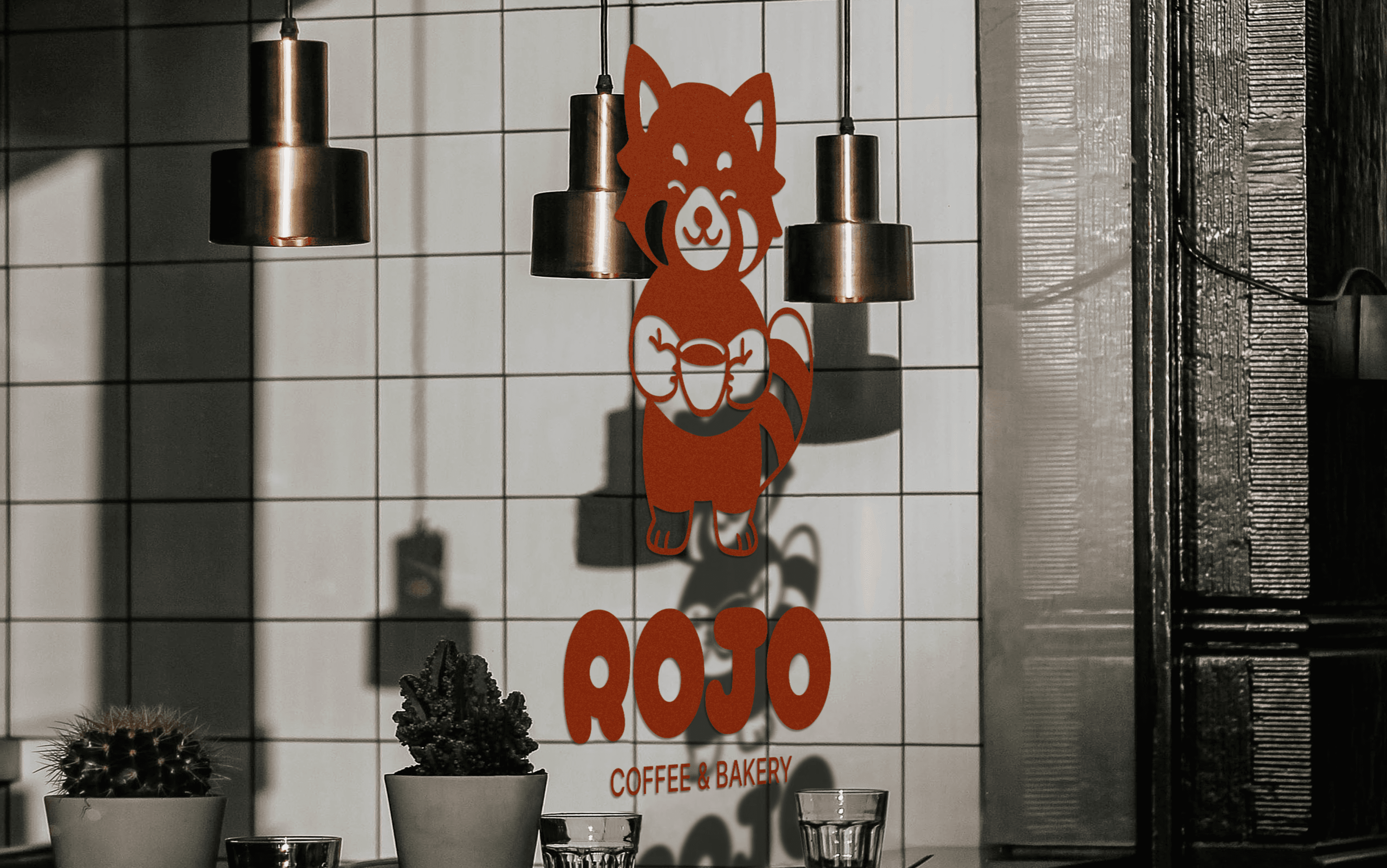
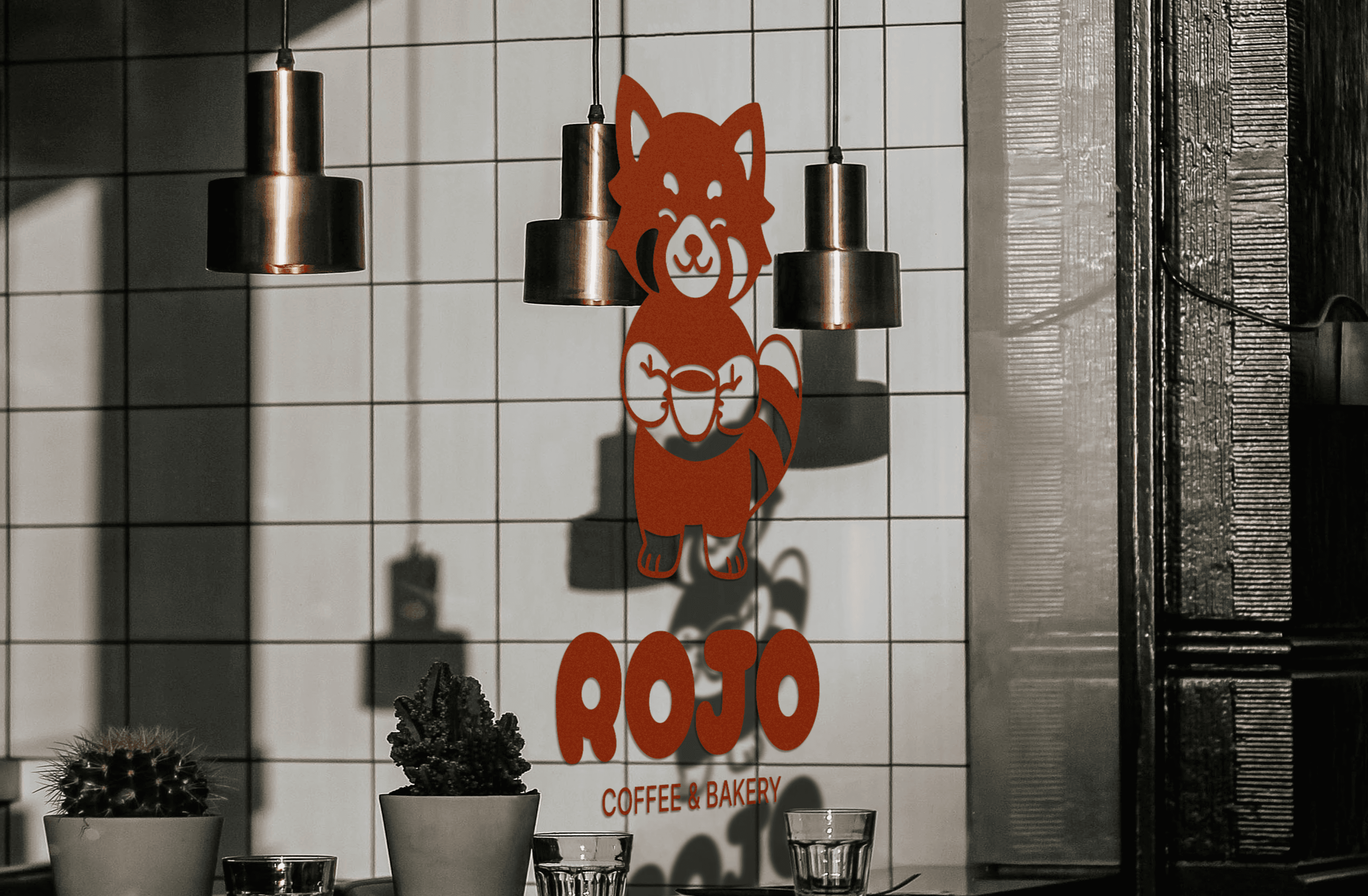
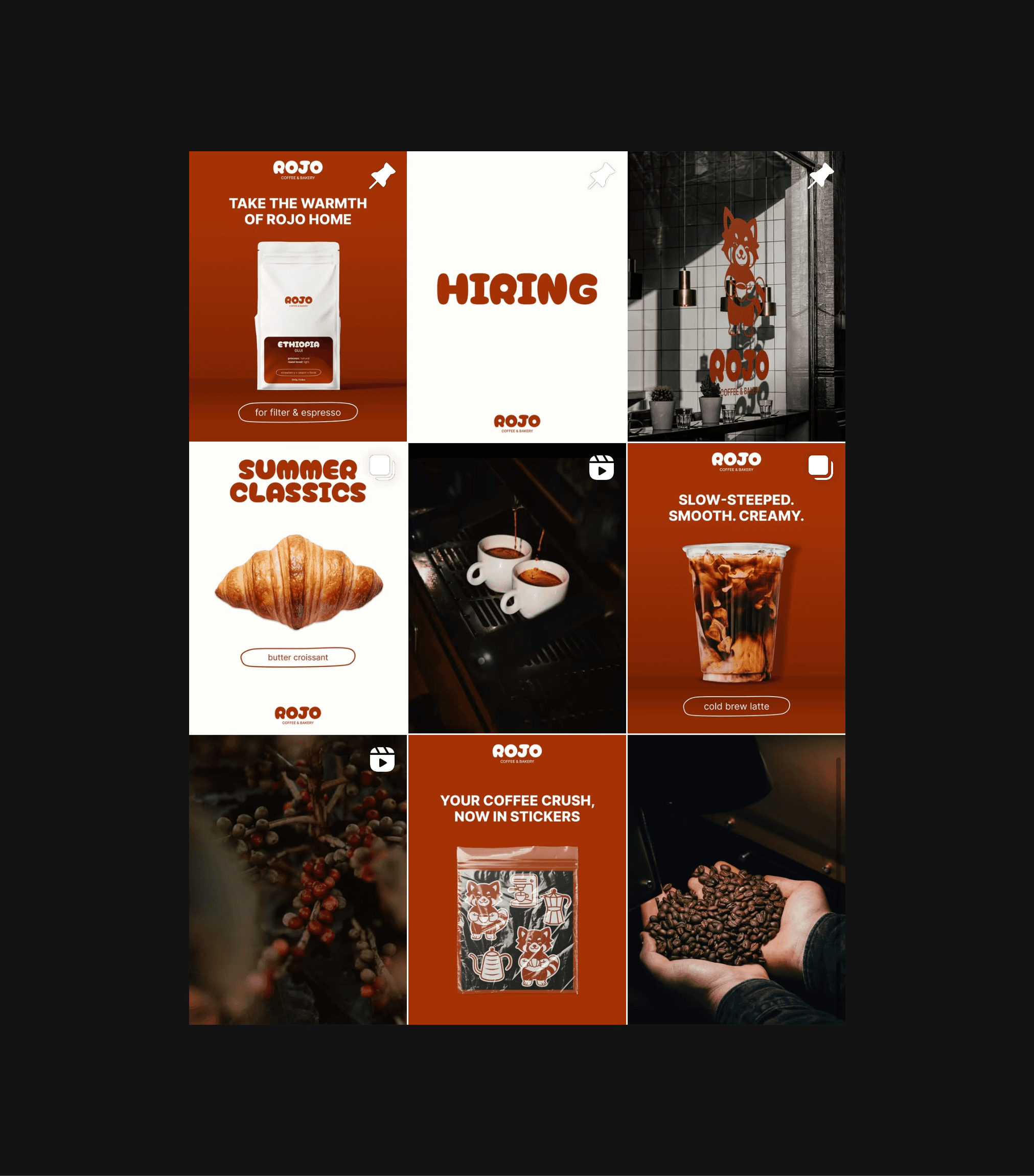
ROJO is an independent specialty coffee shop based in Melbourne, Australia. Inspired by minimalism, modern urban culture, and the warmth of shared moments, it caters to a young and creative audience — students, freelancers, and professionals who care as much about the visual experience as they do about taste.
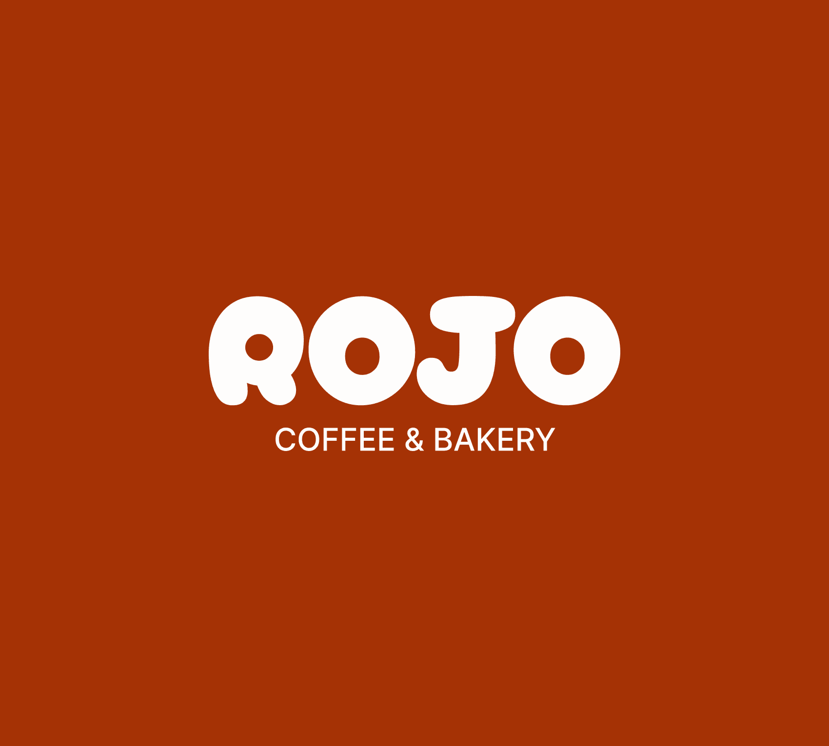
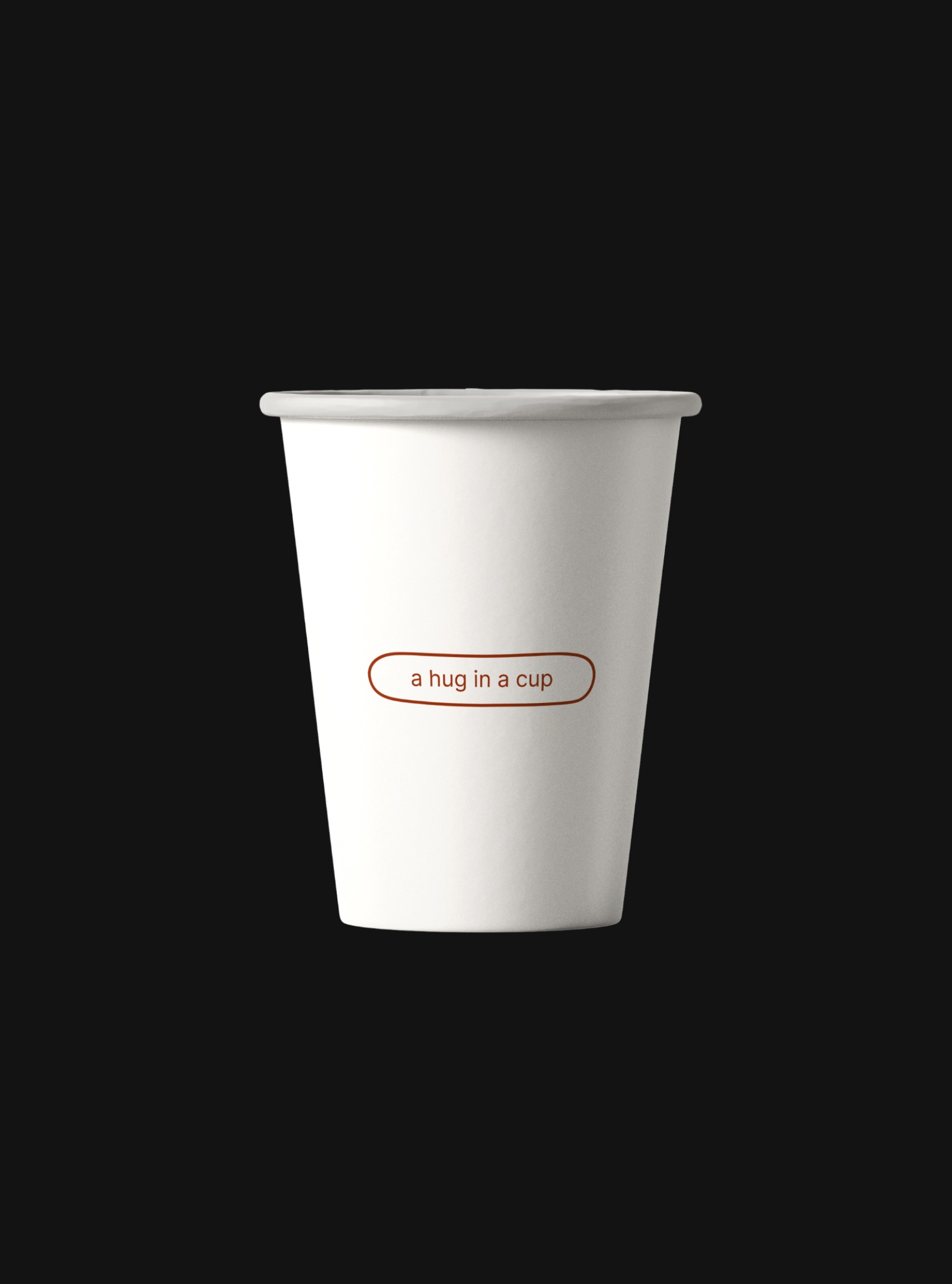
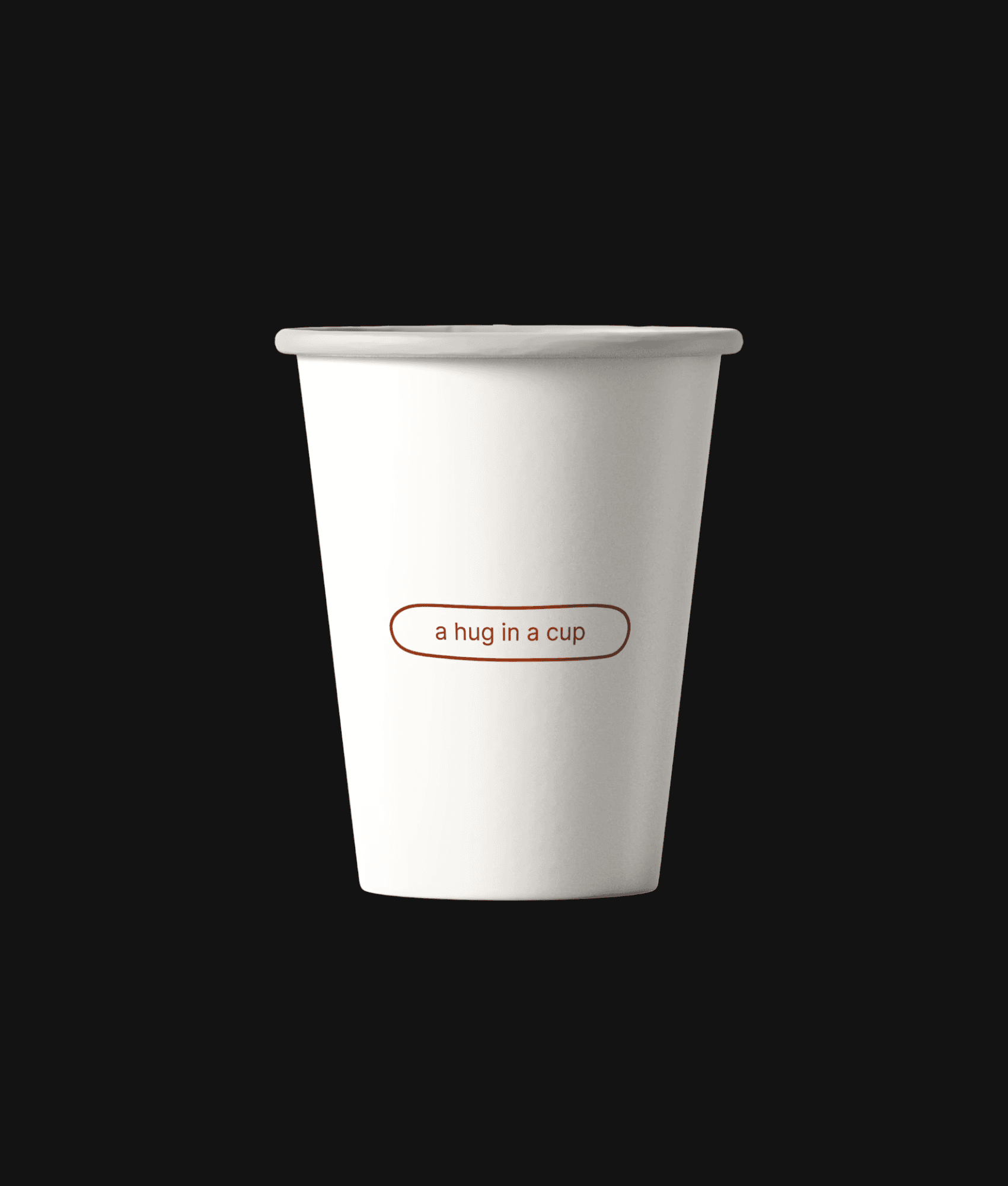
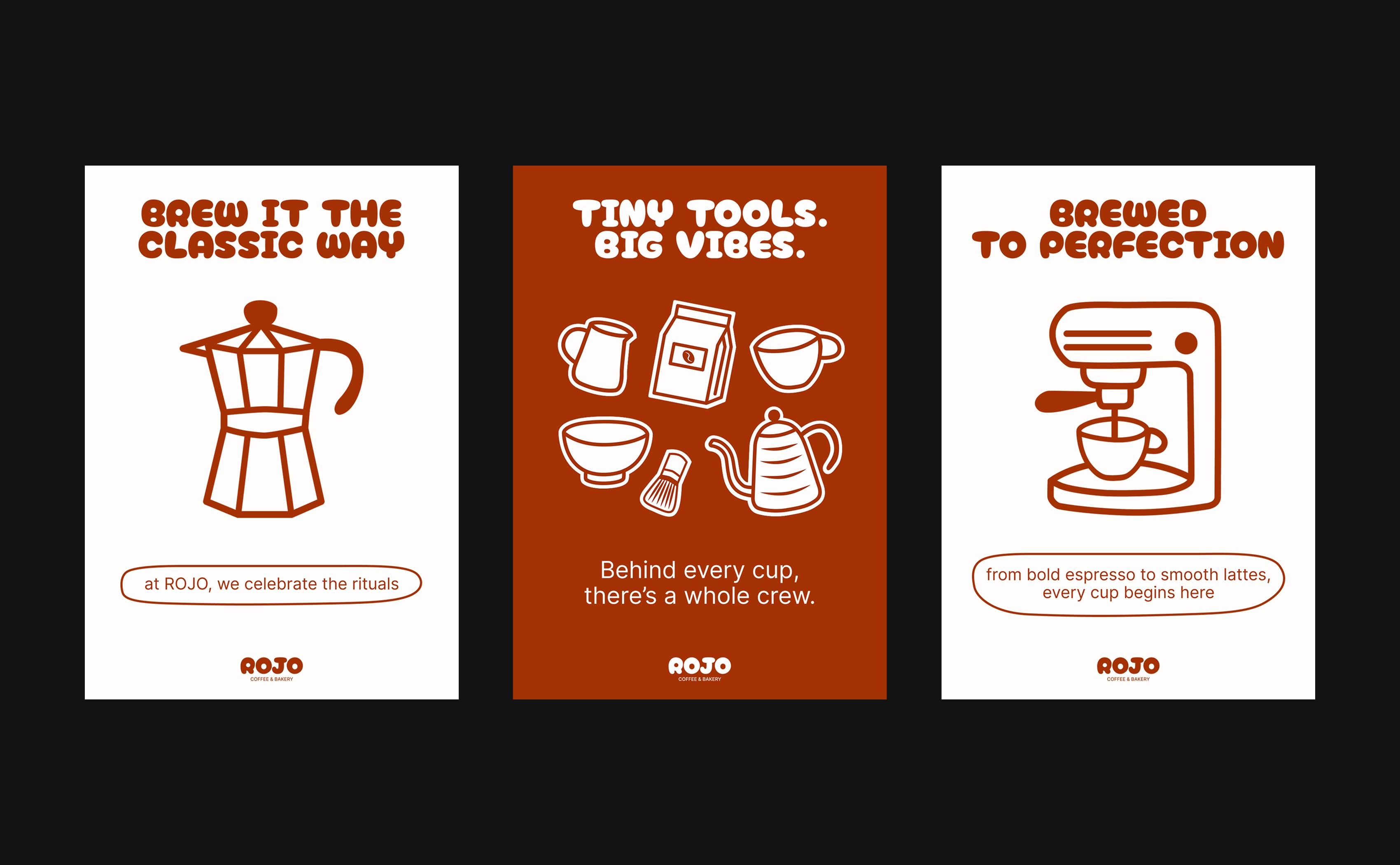
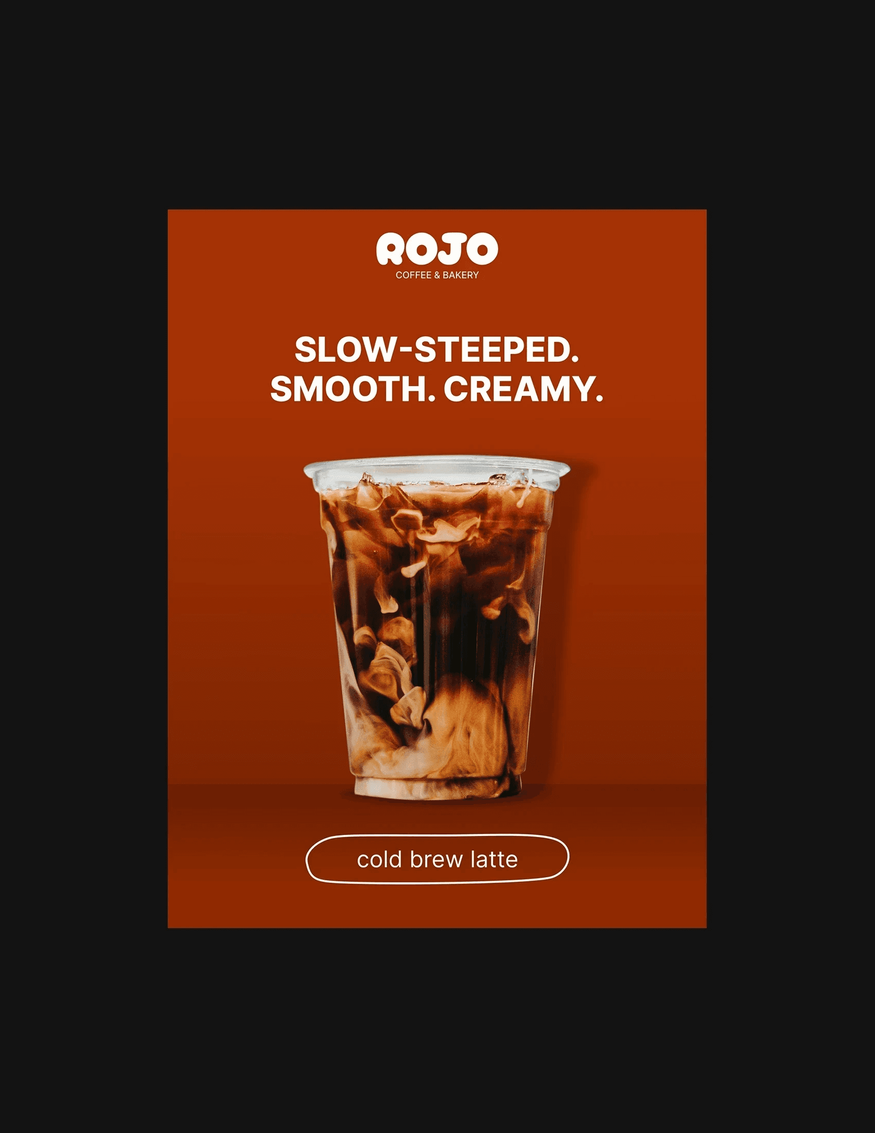
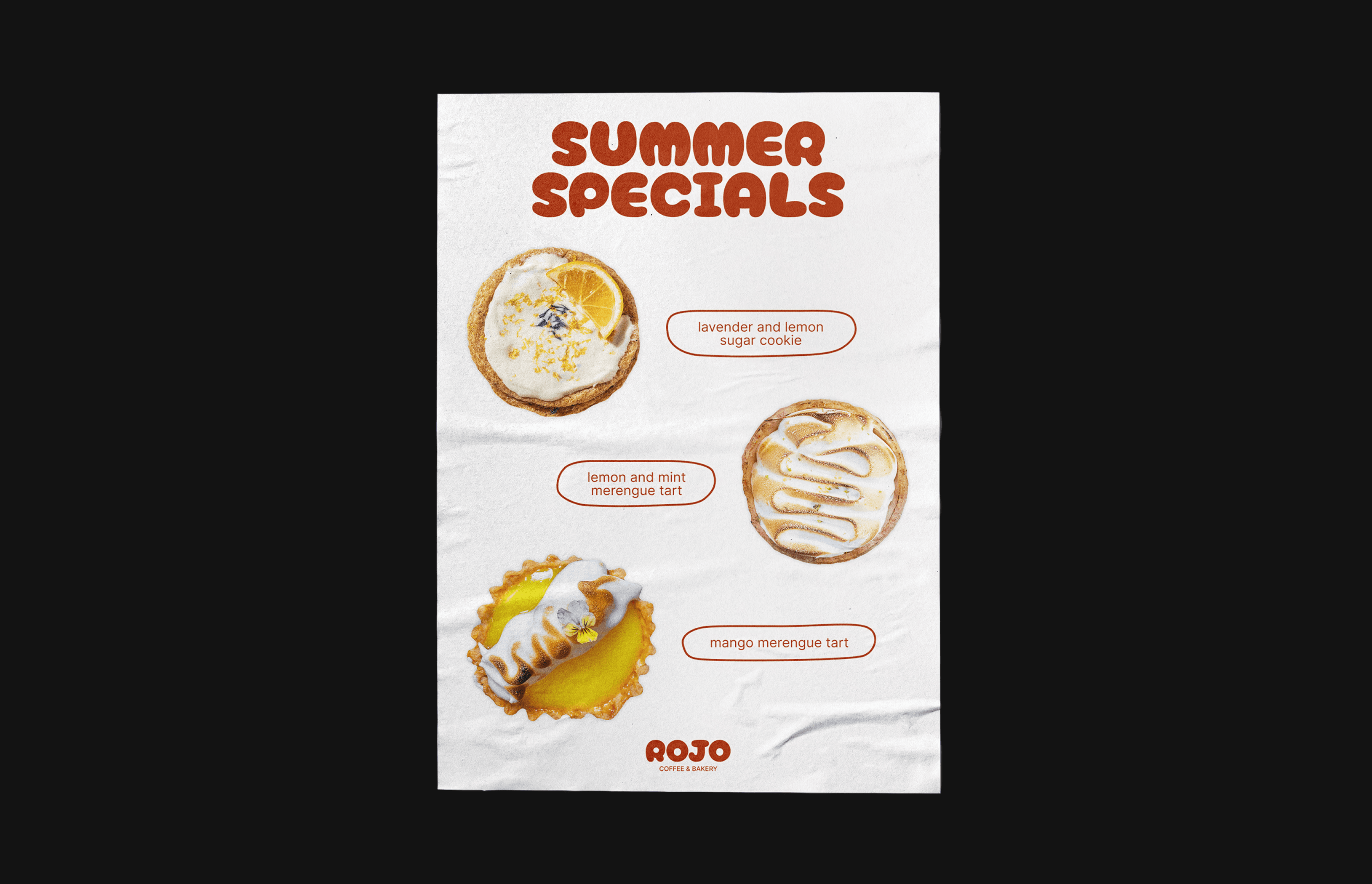
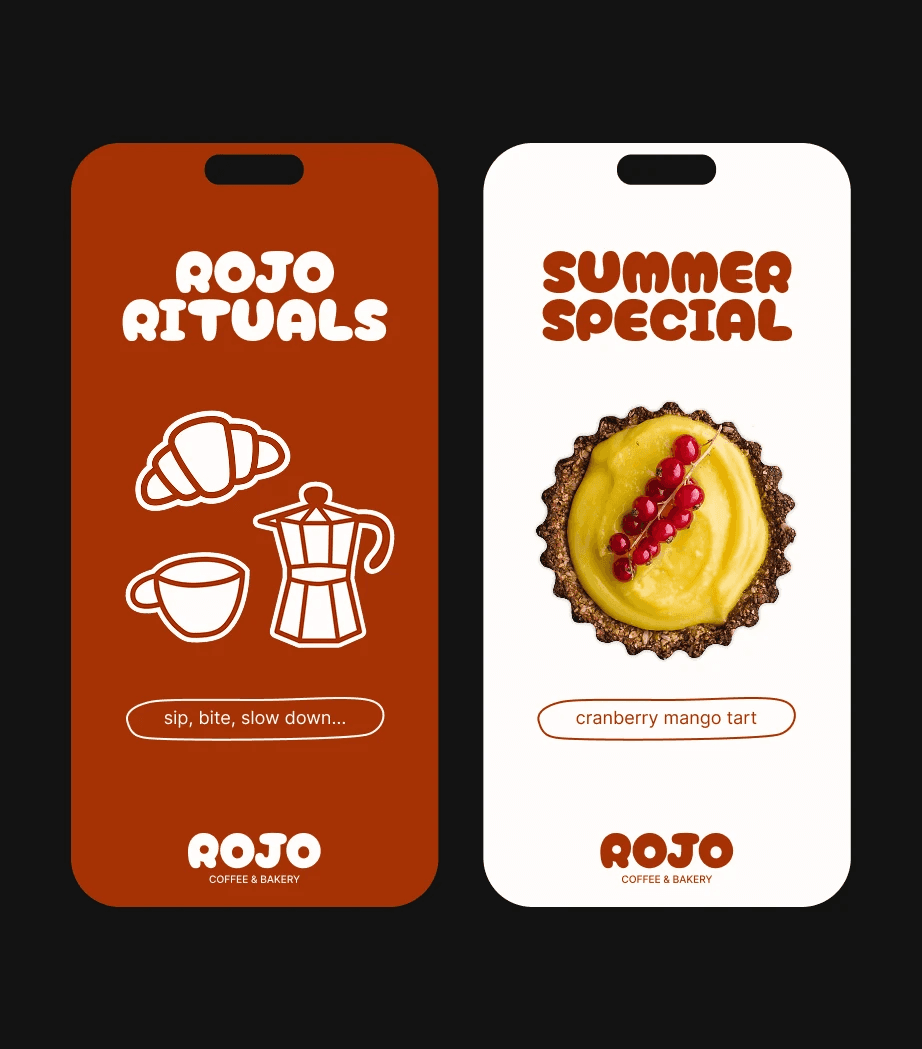
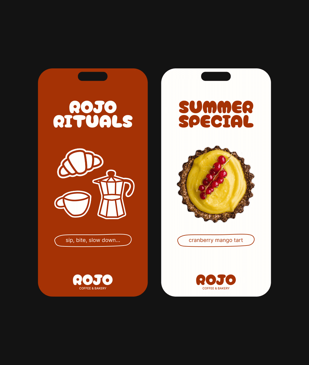
The name ROJO — meaning “red” in Spanish — reflects the warmth of human connection and the vibrant, expressive spirit of the brand. The visual identity is built on contrast: bold, structured typography paired with hand-drawn illustrations and playful graphic accents. A warm and saturated shade of red adds emotional depth and consistency across all brand touchpoints. The typography system combines a friendly, rounded display font with a clean modern grotesque to balance personality with clarity.
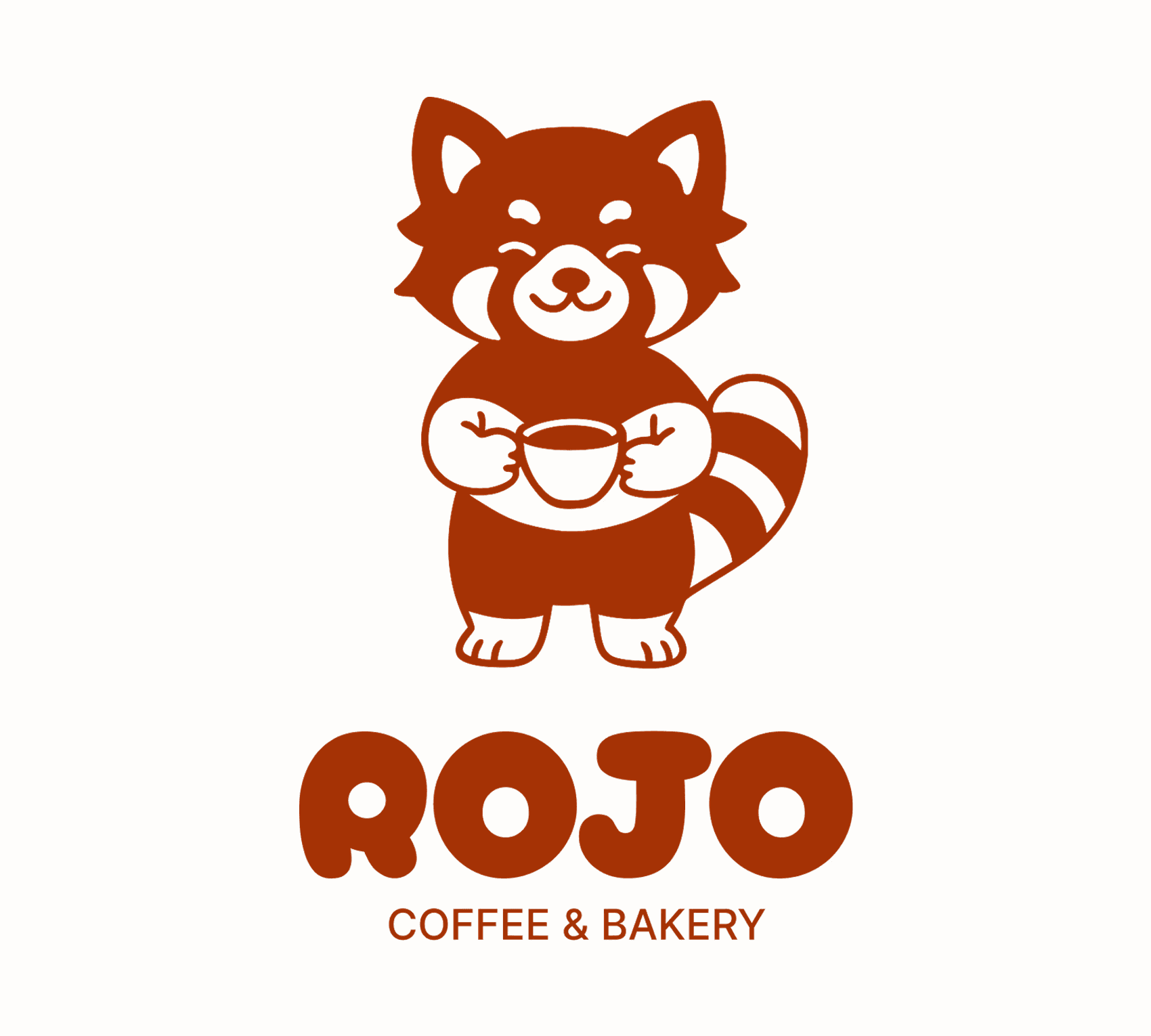
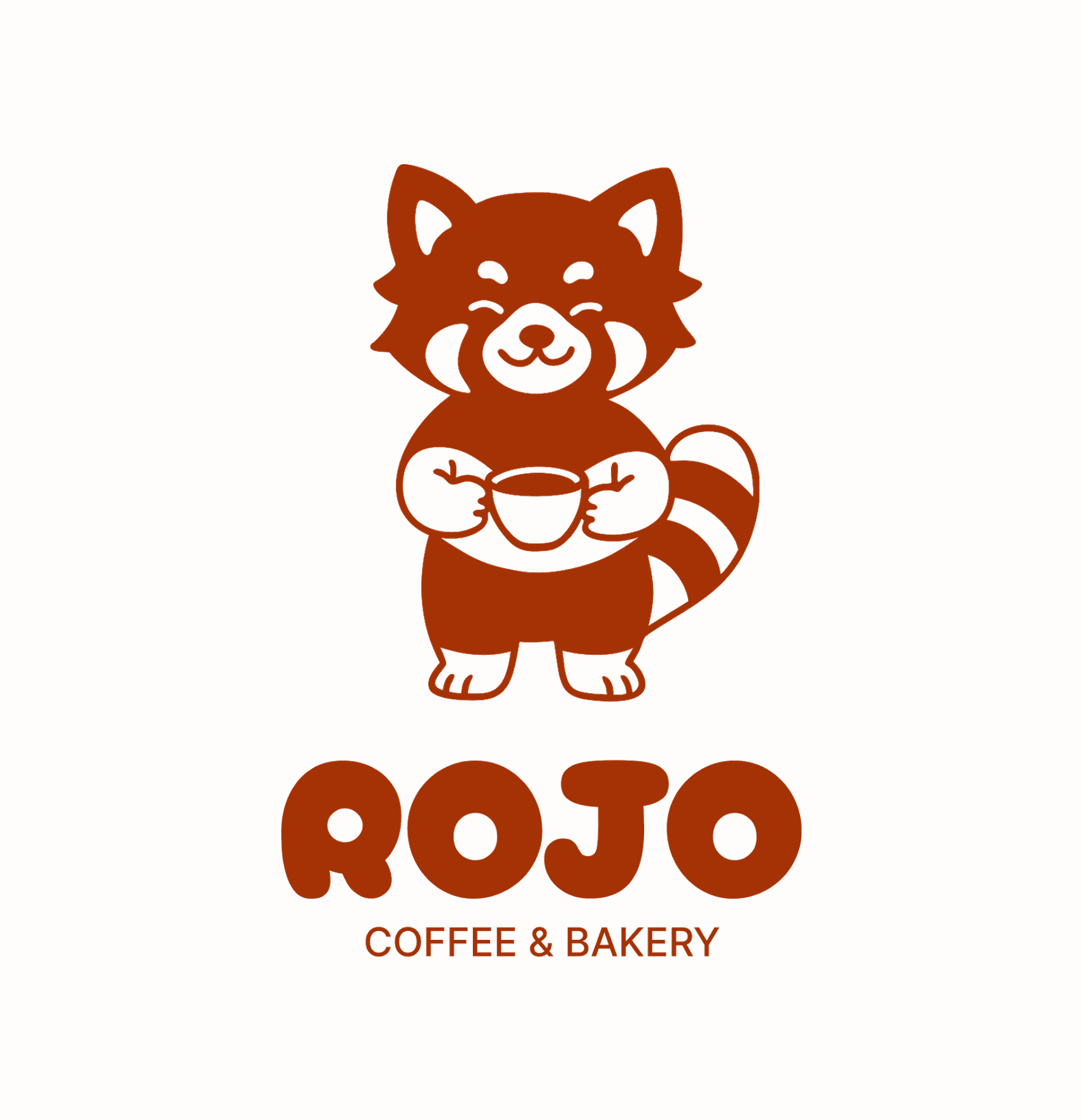
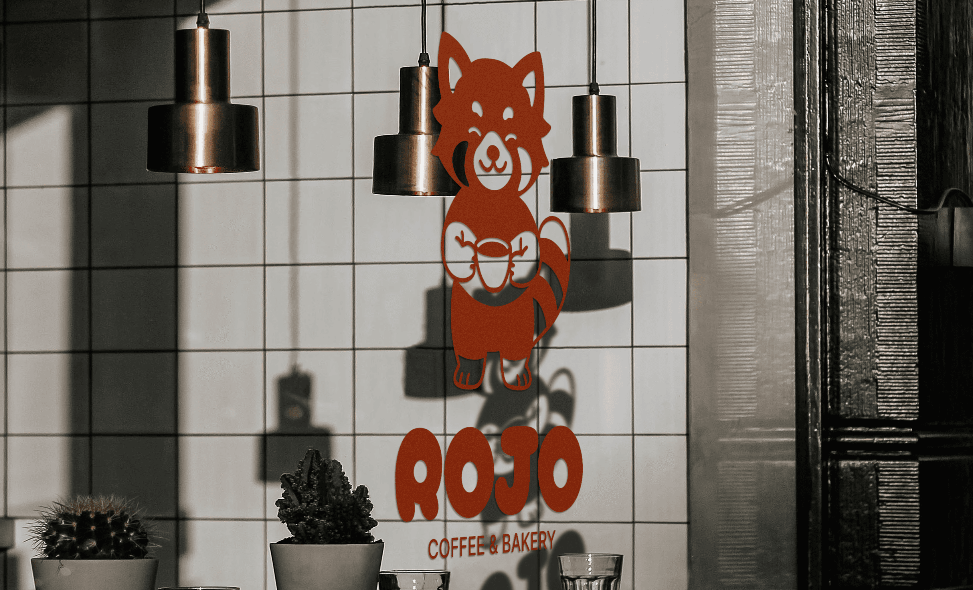
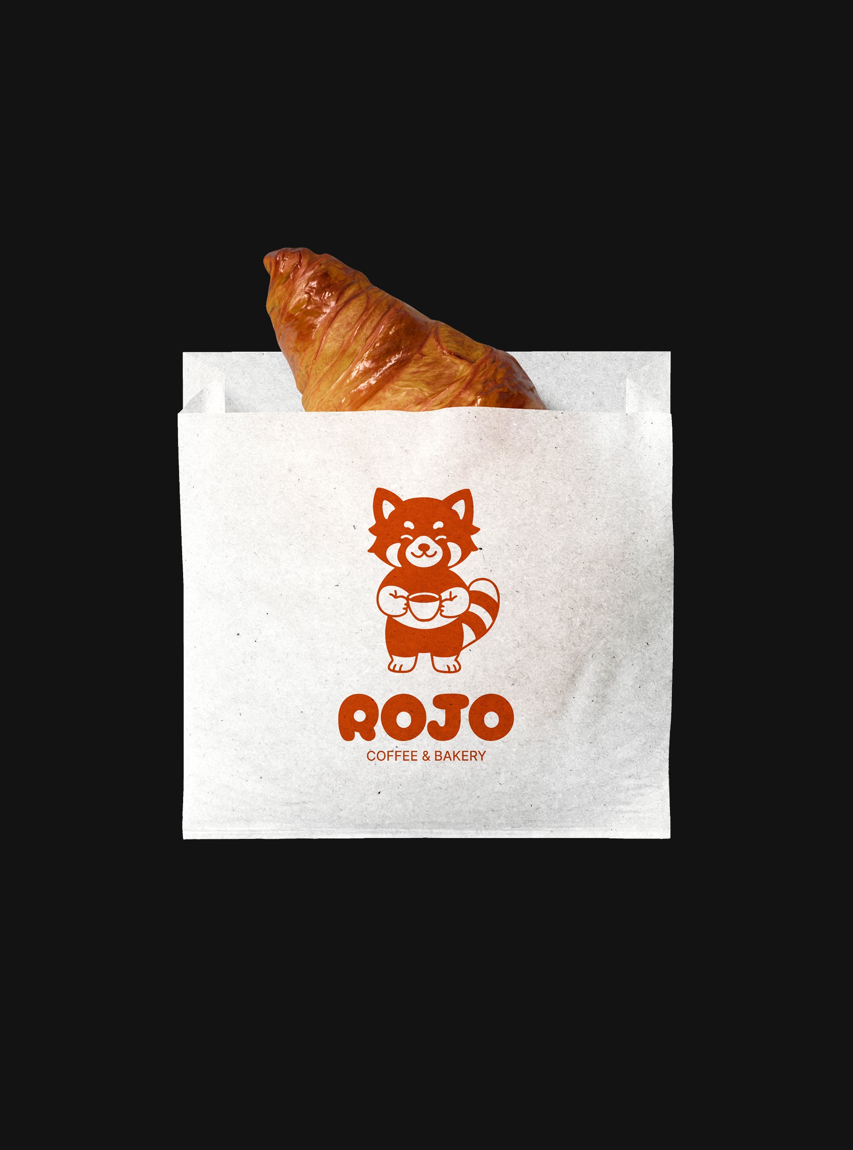
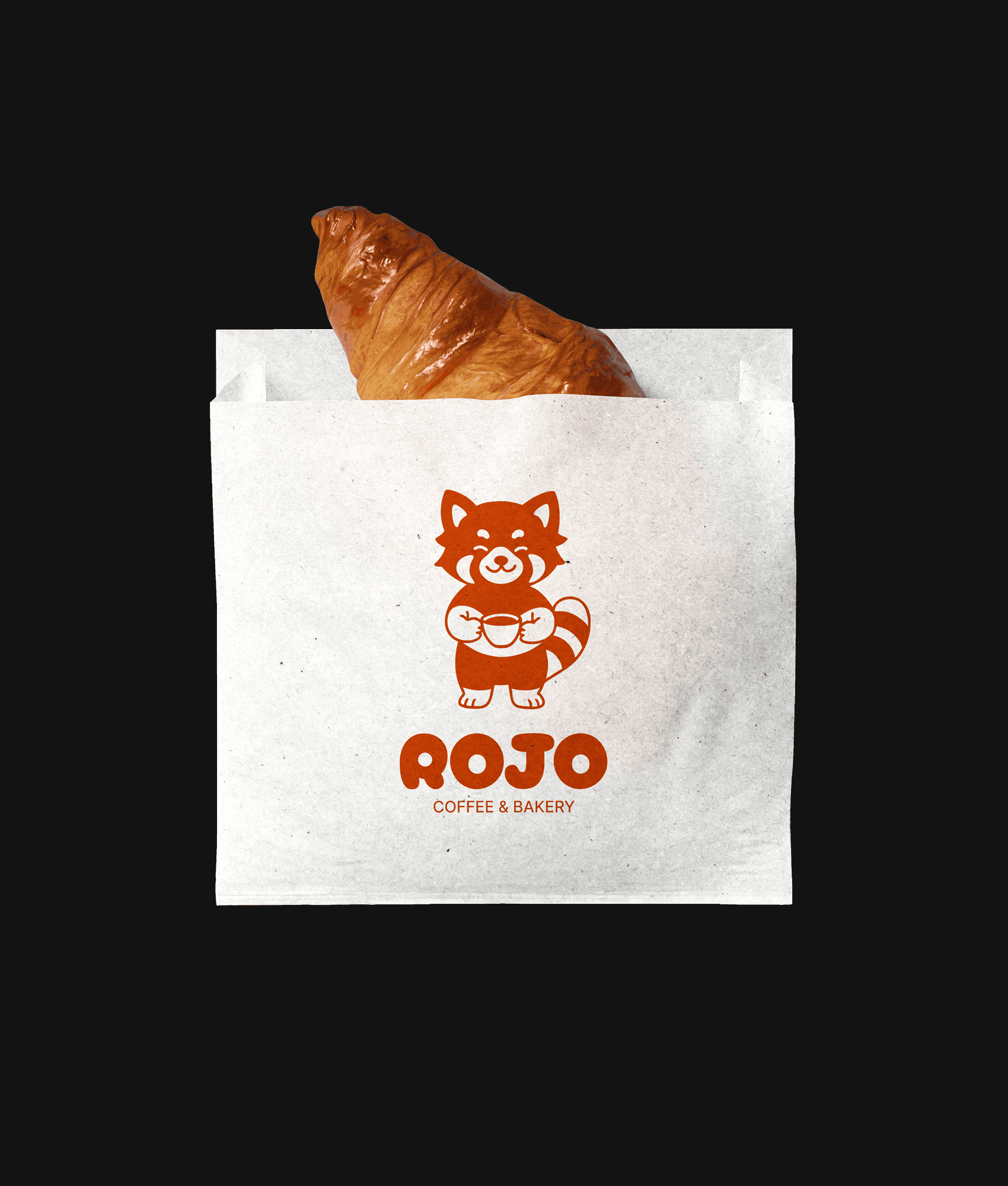
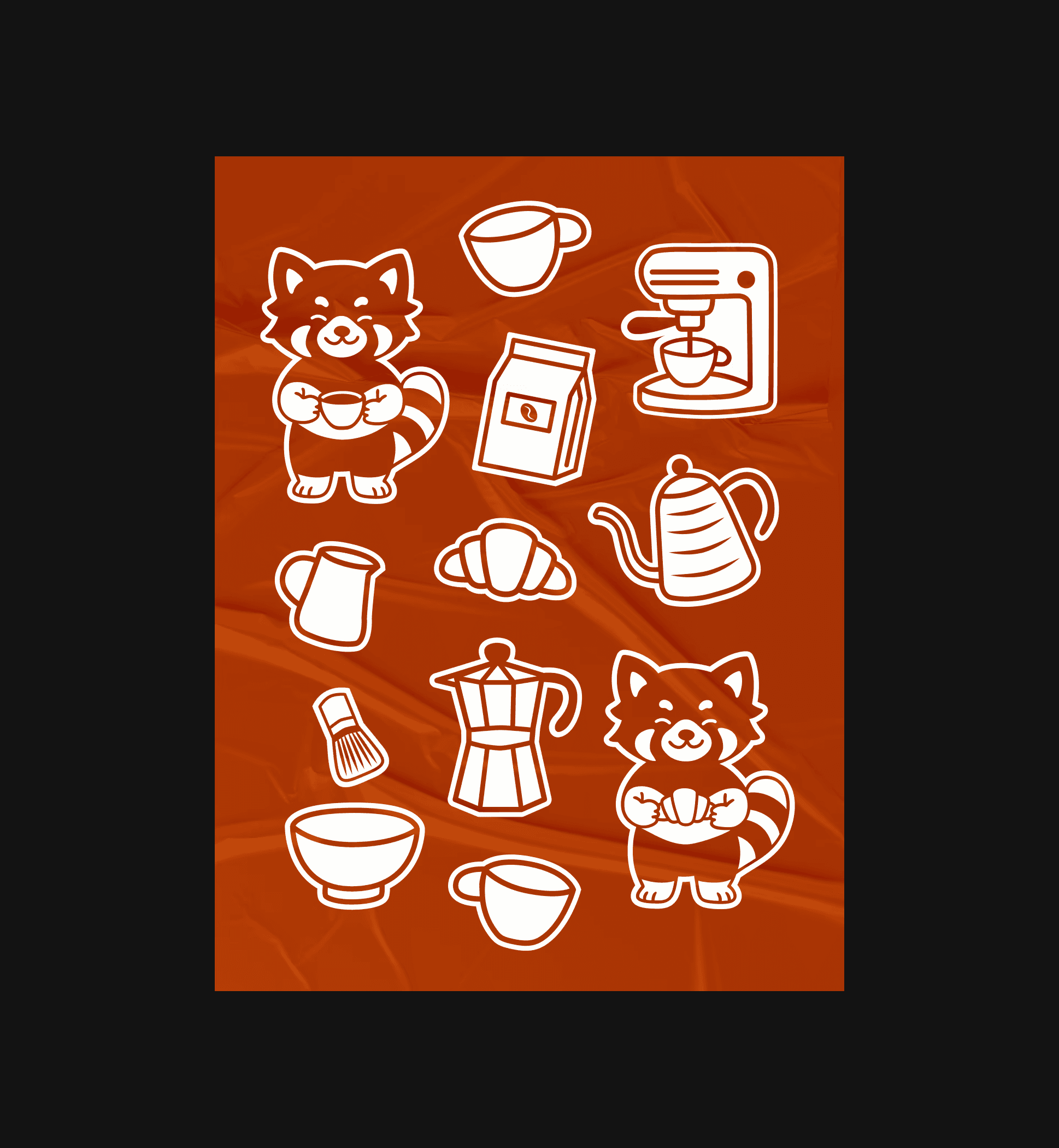
The visual identity features a custom illustrated red panda — a perfect embodiment of ROJO. Warm, curious, and full of personality, it brings a sense of friendliness and approachability to the brand. The hand-drawn style adds character and a human touch, making ROJO instantly recognizable across merchandise, packaging, and digital assets.
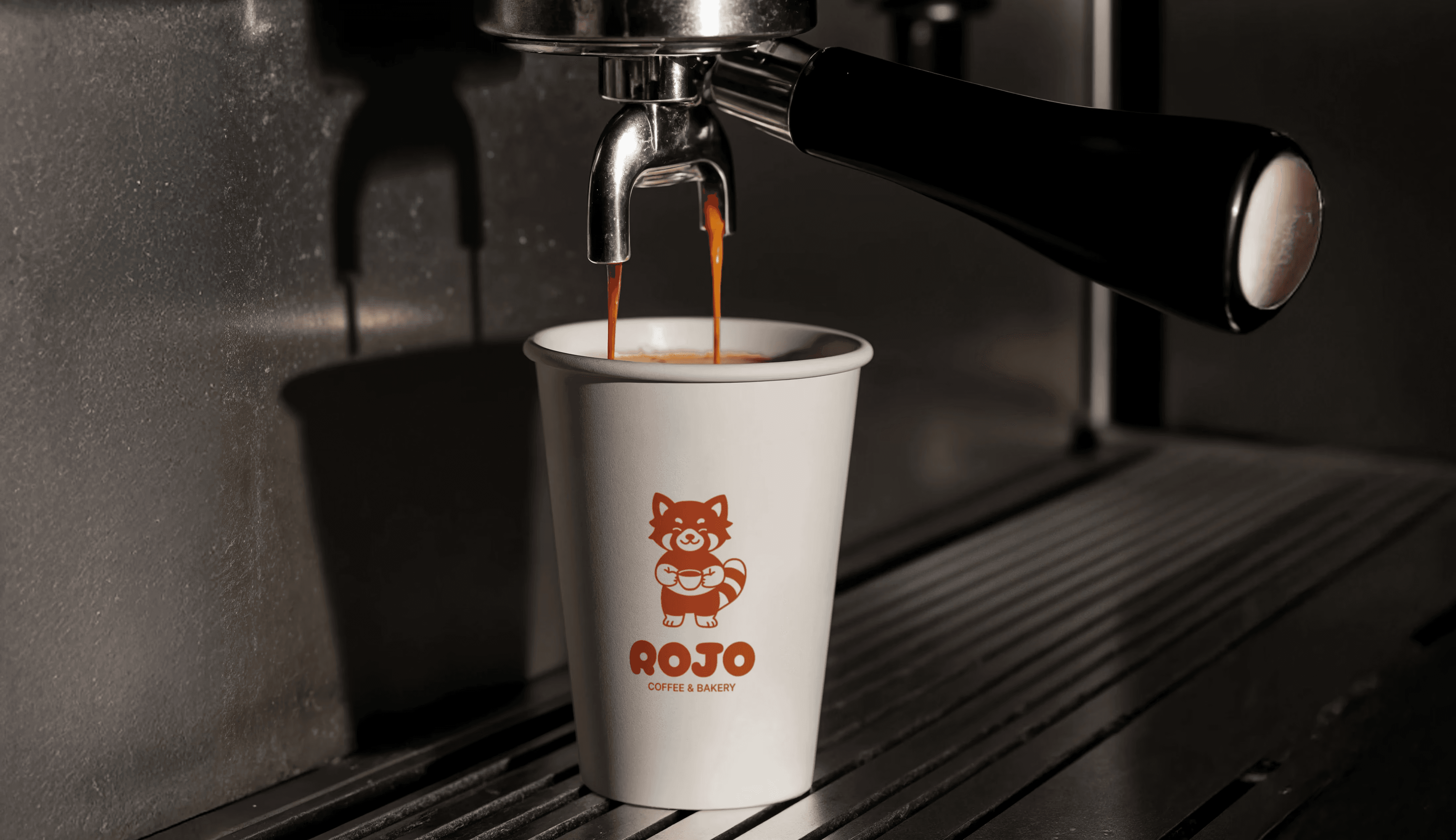
ROJO is an independent specialty coffee shop based in Melbourne, Australia. Inspired by minimalism, modern urban culture, and the warmth of shared moments, it caters to a young and creative audience — students, freelancers, and professionals who care as much about the visual experience as they do about taste.
The name ROJO — meaning “red” in Spanish — reflects the warmth of human connection and the vibrant, expressive spirit of the brand. The visual identity is built on contrast: bold, structured typography paired with hand-drawn illustrations and playful graphic accents. A warm and saturated shade of red adds emotional depth and consistency across all brand touchpoints. The typography system combines a friendly, rounded display font with a clean modern grotesque to balance personality with clarity.
The visual identity features a custom illustrated red panda — a perfect embodiment of ROJO. Warm, curious, and full of personality, it brings a sense of friendliness and approachability to the brand. The hand-drawn style adds character and a human touch, making ROJO instantly recognizable across merchandise, packaging, and digital assets.
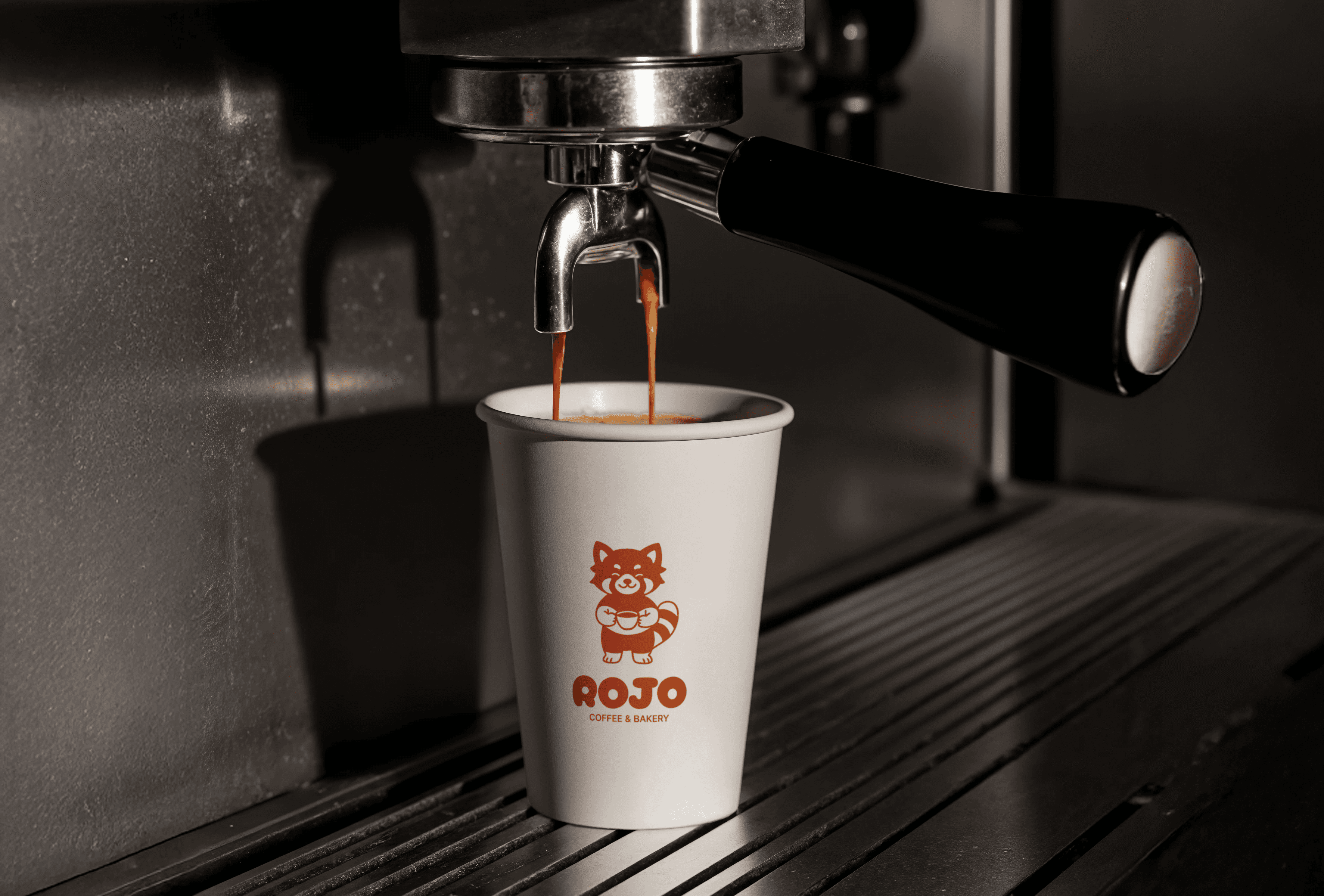
ROJO is an independent specialty coffee shop based in Melbourne, Australia. Inspired by minimalism, modern urban culture, and the warmth of shared moments, it caters to a young and creative audience — students, freelancers, and professionals who care as much about the visual experience as they do about taste.
The name ROJO — meaning “red” in Spanish — reflects the warmth of human connection and the vibrant, expressive spirit of the brand. The visual identity is built on contrast: bold, structured typography paired with hand-drawn illustrations and playful graphic accents. A warm and saturated shade of red adds emotional depth and consistency across all brand touchpoints. The typography system combines a friendly, rounded display font with a clean modern grotesque to balance personality with clarity.
The visual identity features a custom illustrated red panda — a perfect embodiment of ROJO. Warm, curious, and full of personality, it brings a sense of friendliness and approachability to the brand. The hand-drawn style adds character and a human touch, making ROJO instantly recognizable across merchandise, packaging, and digital assets.